

Brand Identity & Package Design Anchoring Memory, Ritual & Belonging

Brand Identity Design, Brochure Design, Package Design
COFFEE LIBERATED
Year:
2024
Timeline:
6 months


Coffee Liberated began with loving reverence.
LaDora Carter, Founder and Head Roaster, came to this project knowing exactly what she desired to amplify - the sacred expression of her business. Coffee Liberated is African and woman-sourced from bean to cup - and rooted in ritual, memory, and community. She wanted a brand design that could hold history and warmth at the same time — something vivid, inviting, and grounded in the shared and grounding experience of coffee.
Our collaboration (with artist Amanda Barnes on logo and package design) focused on designing a visual language that honored coffee as both a daily ritual and a carrier of cultural memory. Together, we imagined Coffee Liberated as a connective thread across the Black experience, weaving together geography, story, and sensory practice. Color became a central storyteller — bold, warming, and generous — echoing the way coffee gathers people. Pattern and rhythm reflected the slow, intentional act of brewing, inviting pause rather than speed.

The cowrie shell emerged as a central symbol within the brand. Historically used as currency and deeply tied to spiritual lineage, the cowrie anchored the design in ancestral continuity, protection, and vibration. Its presence within the logo and packaging gestures toward gratitude, remembrance, and the unseen hands that have shaped coffee’s global journey. The brand also integrates an interactive, diasporic sensibility — nodding to mapping, movement, and community building as essential parts of the Coffee Liberated story.
What resulted is a brand that feels ceremonial without being overly precious, modern without losing its roots. Coffee Liberated invites curious coffee lovers to sip slowly, remember deeply, and feel held by something larger than the cup in their hands.
Scope of Work & Deliverables
Logo and package design created in collaboration with Amanda Barnes
Pattern design inspired by ritual, repetition, and the meditative nature of coffee (with Amanda Barnes)
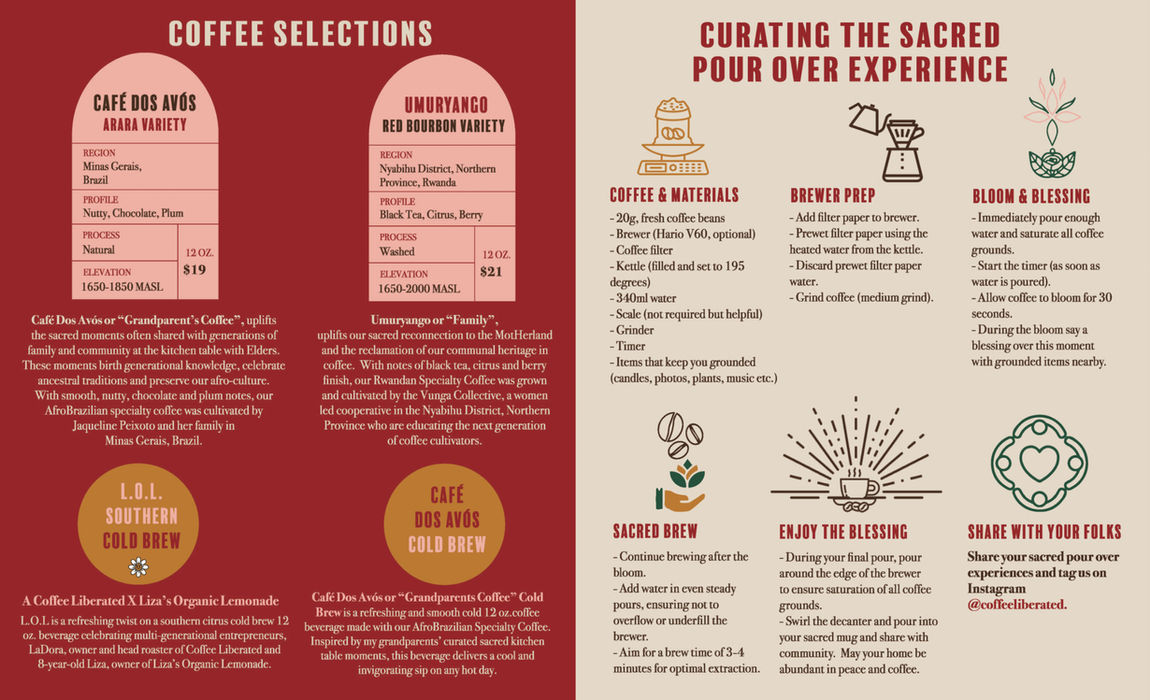
Brochure design communicating brand story, values, and diasporic roots
Visual storytelling connecting African heritage, community, and collective memory


