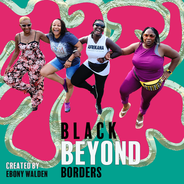


Brand Identity & Graphic Design for a Global Black Storytelling Platform

Brand Identity Design, Graphic Design
EBONY WALDEN CONSULTING
Year:
2025
Timeline:
3 months


This brand was born on the go. Ebony Walden, the Creator of Black Beyond Borders, is a travel enthusiast and has visited more than fifty countries.
She has not only connected with Black communities across the globe but has made a sacred practice of gathering knowledge, history, food, and culture as a way of anchoring and expanding home and belonging. What Ebony desired was a visual identity that could hold these experiences fully and unapologetically. Not travel as spectacle, but travel as intimacy. Not Blackness as monolithic, but as deeply nuanced, regional, particular, and rooted in real experiences. The first season of her episodic series unfolds in Dakar, Senegal, and the brand needed to feel as vibrant, grounded, and worldly as the stories it carries.
Our design process centered on vibrant colors as language. Drawing from the bold prints and palettes of West Africa, the brand designs embrace polyrhythm, tone, texture, and warmth. The work celebrates global Black experiences as something deeply felt through food, terrain, conversation, and collective memory.

The brand visuals were designed to live dynamically across platforms. Social media graphics became an extension of the storytelling itself, inviting audiences into a visual world that feels abundant and enthralling. Pattern, contrast, and scale work together to mirror the energy of travel and the emotional resonance of kinship connections formed across time, land, water, and space.
What emerged are designs that feel like arrival and departure at the same time. It invites curiosity, signals depth, and sets the tone for a series rooted in freedom, movement, and Black global belonging.
Scope of Work & Deliverables
• Brand identity design rooted in global Black aesthetics and West African print traditions
• Development of a vibrant, high-impact color palette
• Graphic design system adaptable across digital platforms
• Social media graphics designed to support episodic storytelling and brand launch
• Visual language reflecting cultural fluency, movement, and diasporic connection


